
Wastewater sampling is one of the few available unbiased indicators of community prevalence of COVID-19 in Vancouver. @YVRCovidPlots is a community service that shares plots made from Metro Vancouver data to help present recent wastewater sampling in historical context.
Early in the pandemic, I was inspired by BC Public Health Officer Dr. Bonnie Henry’s observation that if you explain to people what you need them to do and give them the resources they need to do it, people will overwhelmingly do the right thing.
Lately, provincial officials have been striking a very different tone. In their last regular COVID-19 press conferences, Dr. Henry, health minister Adrian Dix, and BC premier John Horgan bandied about phrases like “personal responsibility.” Horgan, never known to keep his foot far from his mouth, suggested that people troubled by the withdrawal of mask mandates on public transit could simply use hand sanitizer. I’m not sure where he was going with that one.
I think a valuable way to assess government response to a crisis requiring collective action is to ask what government did to enable people to act. Telling the people of BC that they’re responsible for their own decisions, without using the resources of government to help people access and understand the data that could usefully inform those decisions, is hard to understand except as an abdication of responsibility brought on by an exhaustion of political will. I’m tired, too. COVID isn’t.
This Twitter bot is my small contribution to our collective self-defense. I hope it will help my neighbour Vancouverites make decisions about when it feels right to get out and reconnect, and when it’s time to pull out the good masks before a Skytrain trip. In my wildest dreams, this bot will help demonstrate to our leaders that there’s a demand for improving the quality of this data. If you like it, let them know!
How many people have COVID?
Right now, it’s very hard to understand how many people in BC currently have COVID and how quickly that’s changing.
That’s a problem because any given activity can be more or less safe depending on how many people around you have COVID. Getting a sense of whether COVID rates are high or low, and rising or falling, can help you make better decisions and safer plans.
Case counts are not reliable right now because people in low-risk groups in BC are not eligible for PCR tests, which is the only kind of test the government reports. That means the number of positive tests each day isn’t comparable to the numbers that have been reported in the past.
(If you’re in BC, you think you might have COVID, and you’re not absolutely certain you’re in a low-risk group, you should check the guidelines to find out if you’re eligible for PCR testing and treatment.)
In truth, getting a good estimate of COVID prevalence—the fraction of people in a population who have COVID at any given moment—is always hard. Counting confirmed positive tests always undercounts actual cases because not everybody with COVID gets a test, and sometimes tests give false negative results. Test positivity rates (number of positive tests divided by the total number of tests delivered) can help you understand whether a testing program is missing an unusually high number of cases, but you can’t interpret it as a population prevalence because it’s not a random sample of the population—people who have a reason to get a test are more likely to have COVID than people who don’t.
If you could test everyone, every day, you’d be able to measure prevalence more or less exactly. Of course, doing that with nasal swabs would be economically and politically untenable. You could try to assemble representative samples, using either a panel of volunteers you test regularly or recruiting people going about their daily lives for a quick swab, but most governments don’t seem to feel this is an effective use of public health staffing and laboratory resources.
Wastewater sampling
Another approach that comes close to our ideal for assessing infectious disease prevalence is wastewater sampling, which avoids sampling bias among the sewer-connected population because everyone poops. Taking samples from wastewater processing plant inflows requires relatively little dedicated labor, and running just a handful of laboratory tests gives you information about an entire community.

Wastewater sampling has its own challenges. For example, not all effluent passing through a treatment station came from a toilet. Industrial discharges and flows from stormwater, sinks, and showers can ebb and flow irregularly over the course of a day, which can unpredictably dilute waste in the sampling stream. There are more and less sophisticated ways of correcting for waste flows from other sources. A relatively fancy way is to use other viruses found in human waste as a control: pepper mild mottle virus is a plant RNA virus that passes right through us when we eat peppers. Expressing COVID concentration relative to PMMoV concentration lets you factor out other sources of effluent. A simpler method, used in Vancouver, is to assume that most variation comes from industrial and environmental sources and that treatment plants process about the same amount of human waste each day. Multiplying the measured concentration by the total volume of flows passing through the plant each day yields a daily COVID copy count, which removes the effect of dilution from other sources.
Metro Vancouver
Metro Vancouver is a regional district of BC which delivers services to the Lower Mainland, including water and sewerage. Metro Vancouver has been measuring and reporting COVID-19 levels in wastewater since summer 2020. I think Metro Vancouver and BCCDC deserve praise for providing this public service.
But there are a couple of problems:
-
Testing frequency is low. Wastewater is only sampled three days a week, on Monday, Wednesday, and Friday.
-
Testing latency is high. Wednesday, Friday, and Monday results are posted each Friday— so two of the new data points we get each week are already more than a week old.
-
It’s hard to use the plots on the Metro Vancouver website. Only a few data points from a single plant are visible at a time and the bar plots don’t make it easy to understand changes over time.
Slow and infrequent testing severely limits the usefulness of this data as a way to help people make better decisions. There are plenty of examples of governments doing better. For instance, Massachusetts Water Resources Authority, which serves greater Boston, takes samples daily and has a one-day turnaround. That’s news you can use!
There’s not much I can do about the first two points (contact your city government, Metro Vancouver, and your MLA to let them know you want better wastewater data from Metro Vancouver and BCCDC!) but I do know how to make a plot. Let’s see if we can make the data we do have easier to interpret.
Finding the plot
The first challenge: can we get the data in order to plot it? Pleasantly, Metro Vancouver’s plots page uses dynamic plots, which retrieve the data in the background from a public Sharepoint API. We can access the same API from a script to get machine-readable, readily plottable data.
The next challenge: what’s the right data to plot? Metro Vancouver provides both measured COVID concentration (copies/L) and an estimate of total daily COVID copies (copies/day). The latter is computed from the former by multiplying it by the volume of wastewater that passes through each water treatment plant each day. As discussed above, this is intended to help reduce the impact of dilution from environmental flows on the data. Whether it normalizes the data effectively is unclear; you can imagine a number of problems that could arise depending on the uncertainty of the volume data, the details of the sampling procedure, and the timing of the samples versus the timing of irregular flows. Metro Vancouver doesn’t share details on their sampling process.
In practice, they yield pretty similar looking curves if you put them on the same scales:
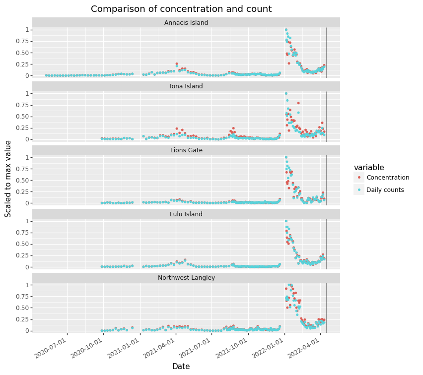
Normalization seems unnecessary here, and seems to suppress the signal from the 2nd and 3rd waves seen at Iona Island. I’ll prefer the rawer concentration values instead of the normalized copy values.
The next challenge: what should the plots look like? After playing with a few options, I settled on something similar to MWRA’s approach of presenting both data since the beginning of the pandemic, as well as a subset of recent data, to help give a sense of both global and local context for the latest numbers. I thought using small multiples to present each plant made it easier to appreciate the differences in the regional evolution of the pandemic than overplotting them in different colors.
An annoying problem is that the Omicron peak in January 2022 swamps the earlier waves; I tried applying a log transformation to the y axis but I found the result even harder to interpret.
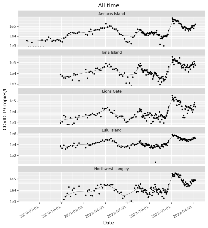
This is what I ended up with:
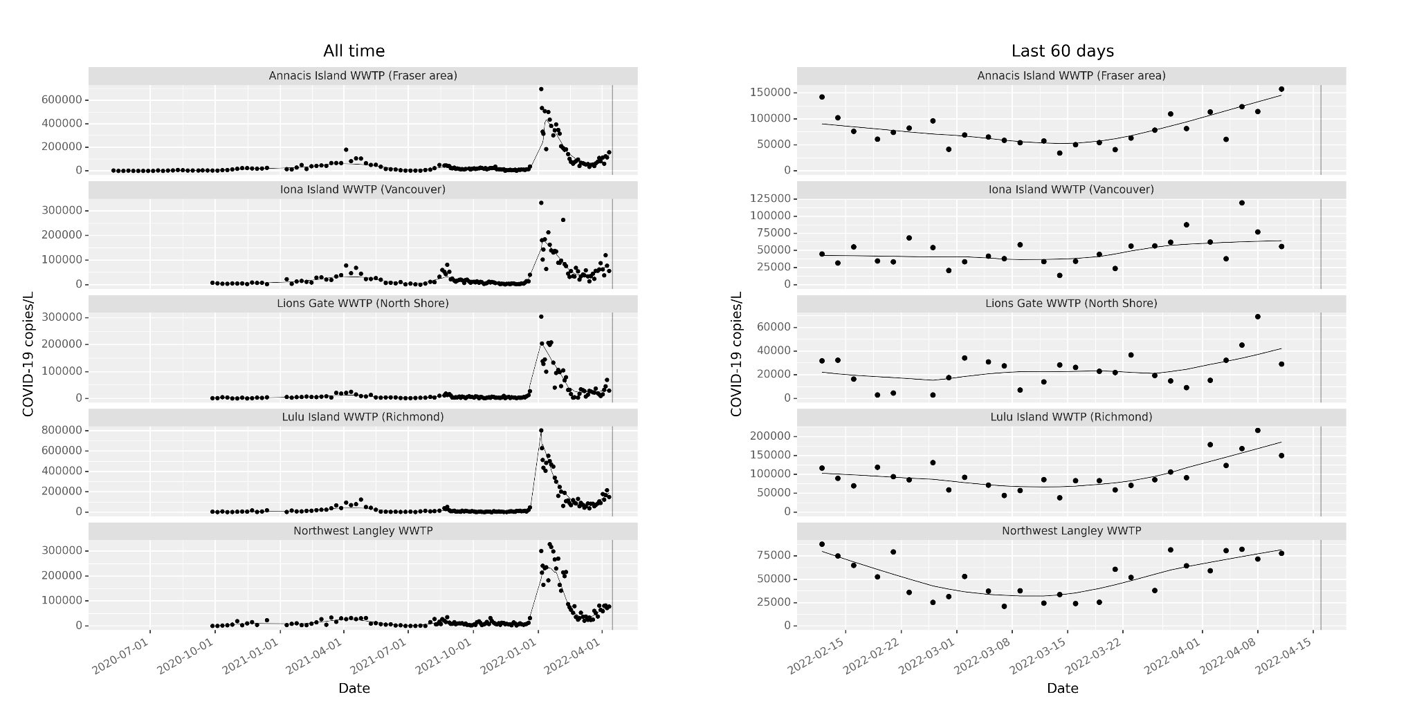
The vertical lines indicate the current date, to show the gap since the last measurements.
Finally, how should I share these? I think one shouldn’t have to be a data scientist to be an informed citizen, so I want to get these out in the commons. I’ve been inspired by Vancouver CBC reporter and man-about-town Justin McElroy, who helpfully informed the COVID discussion in BC by making and posting accessible plots. I’m a sucker for a Twitter bot, so I decided to give that a try.
The bot tweets as @YVRCovidPlots, and the script lives on Github.